THE ART OF FRIENDSTER
Since I joined friendster in the end of 2003, there were lots of changes to their web interface, features and the system which are for me, much much better than before. From JSP to PHP, now every updates by our friends in the network will be displayed on our Homepage. That's great! At least now we can view friends' profile each and every time they add new photos and their profiles info.
That one is OK.
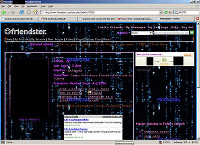
Actually, by giving too much additional features to the members sometime can spoil them. You know why? See these examples :


I almost kissed my monitor, reading a single word of the content. What i can see only those blinking background images and colourful fluorencent fonts. This morning (for the first time), i clicked on friendster's 'About Us' to read their main objective of developing this type of network community :
Showing off your colorful backgrounds wallpapers, blinking images and fancy fonts are not the purpose of Friendster. It's for us to stay in touch with your friends and it's the fastest way to discover the people and things that matter to you most and what else? They also mentioned, to make the world a smaller place by bringing the power of social networking to every aspect of life, one friend at a time. So why you still want to stop people from reading your profile by putting those user unfriendly wallpapers, fonts and those blinking stuff? Cmon, keep it sweet and simple. If you still want to make the page looks nice and unique, use lighter colors and effects. That will be much BETTER.
"Who cares! I can do what i like in MY friendster.. who are you to complain?"
I'm sorry. Just think about others who spending their time viewing your profiles.
Note :
If the screenshots belongs to you and you happened to read this, millions apologies. This post is not to condemn anybody. I have to rephrase that.
That one is OK.
Actually, by giving too much additional features to the members sometime can spoil them. You know why? See these examples :


I almost kissed my monitor, reading a single word of the content. What i can see only those blinking background images and colourful fluorencent fonts. This morning (for the first time), i clicked on friendster's 'About Us' to read their main objective of developing this type of network community :
About Friendster
With more than 24 million members, Friendster is the best way to stay in touch with your friends and it's the fastest way to discover the people and things that matter to you most.
Headquartered in the Bay Area, Friendster aims to make the world a smaller place by bringing the power of social networking to every aspect of life, one friend at a time.
Showing off your colorful backgrounds wallpapers, blinking images and fancy fonts are not the purpose of Friendster. It's for us to stay in touch with your friends and it's the fastest way to discover the people and things that matter to you most and what else? They also mentioned, to make the world a smaller place by bringing the power of social networking to every aspect of life, one friend at a time. So why you still want to stop people from reading your profile by putting those user unfriendly wallpapers, fonts and those blinking stuff? Cmon, keep it sweet and simple. If you still want to make the page looks nice and unique, use lighter colors and effects. That will be much BETTER.
"Who cares! I can do what i like in MY friendster.. who are you to complain?"
I'm sorry. Just think about others who spending their time viewing your profiles.
Note :
If the screenshots belongs to you and you happened to read this, millions apologies. This post is not to condemn anybody. I have to rephrase that.

>> Posted byBest regards from NY!
» »
» Post a Comment